
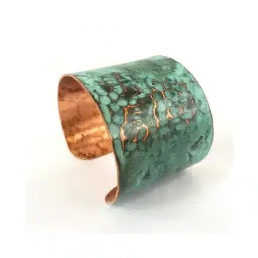
Patinated copper is unusual because its appearance isn’t meant to stay perfectly uniform. Brown, russet, charcoal, blue, and green tones can give the material a sense of age and depth that manufactured color rarely matches. Strong patinated copper ideas treat those variations as part of the design, using the metal where gradual visual change adds rather than distracts.
Choose Areas Where Copper Can Be Seen Up Close
Copper becomes especially interesting on surfaces people pass frequently. Kitchen backsplashes, bar fronts, fireplace panels, cabinet inserts, wall niches, and decorative doors allow the changing finish to remain visible.
Architectural inspiration from patio and exterior design references can also show how aged metals develop stronger personalities beside stone, masonry, timber, and plants. Indoors, the same material relationships often feel warmer and more controlled.
Make One Surface the Main Feature
A broad copper panel can become the visual center of a room without requiring additional artwork. Because the finish already contains variation, nearby surfaces should usually remain calmer.
Balance Copper With Quiet Background Materials
Patinated copper can become busy when surrounded by highly figured stone or heavily patterned tile. Plain plaster, limestone, concrete, dark wood, and simple painted cabinetry give the metal more room to breathe.
Homes built around layered interior materials often succeed because one expressive surface is supported by quieter finishes. A mottled copper backsplash behind flat-front cabinets, for example, creates character without turning the entire kitchen into a decorative statement.
| Copper Feature | Supporting Material | Result |
|---|---|---|
| Backsplash | Plain cabinetry | Focused texture |
| Fireplace panel | Limestone | Warm contrast |
| Cabinet insert | Dark timber | Rich depth |
| Wall art panel | Soft plaster | Subtle drama |
Use Patina in Smaller Decorative Moments
Copper doesn’t need to cover a full wall. Lamp shades, mirror frames, handles, trays, table tops, planter covers, and narrow trim pieces can introduce its shifting color in smaller doses.
In relaxed interiors, these accents work particularly well with textiles and warm ambient light. Collections centered on inviting home setups can offer useful context for pairing aged metal with linen, wool, timber, and softer furniture forms.
Repeat the Material Without Matching It Perfectly
Two copper elements don’t have to show identical patina. Slightly different tones can actually make the room feel collected rather than manufactured, provided the overall palette remains related.
Understand That Patina Is Part of the Story
Copper may continue changing depending on its finish, exposure, handling, moisture, and maintenance. Some owners enjoy that evolution, while others prefer a more predictable appearance.
Before choosing the material for high-touch areas, decide whether natural variation will feel attractive or irritating. A surface that changes gradually requires a different mindset from stainless steel or factory-painted metal.
Where Patinated Copper Can Disappoint
The most common mistake is expecting every sheet or fitting to look identical. Patina is valued partly because it isn’t perfectly consistent. Trying to force exact color matching across large installations can undermine the natural effect.
Copper can also lose impact when repeated across too many objects. A backsplash, pendant cluster, hardware set, sink, shelf, and decorative wall may compete with one another. One dominant copper feature supported by one or two smaller references usually creates a stronger composition.
Frequently Asked Questions
Does patinated copper suit contemporary interiors?
Yes. Its aged appearance creates an effective contrast with clean cabinetry, simple plaster walls, glass, concrete, and minimalist furniture. The surrounding design can remain modern even when the copper itself looks weathered.
Will copper patina keep changing indoors?
It can, although the rate and degree depend on the finish and environmental conditions. Sealed or treated copper may behave differently from an untreated surface, so the expected maintenance should be discussed before installation.
What colors work with patinated copper?
Warm white, charcoal, olive, deep blue, brown, muted green, and natural wood tones often complement copper well. Neutral backgrounds are especially useful when the patina already contains several visible colors.
Let the Surface Develop Character
Patinated copper is most convincing when its changing surface is treated as a feature rather than a flaw. Choose one place where the material can attract attention, keep neighboring finishes restrained, and accept a degree of irregularity. That approach allows copper to develop the rich, lived-in quality that makes it different from more predictable metal finishes.